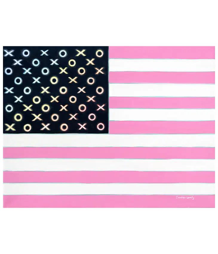
“Each painting tells a story in black and white, with a medium hue of pink.”
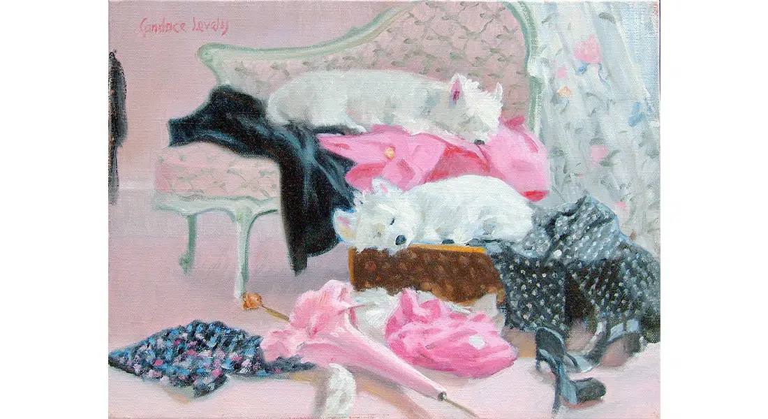
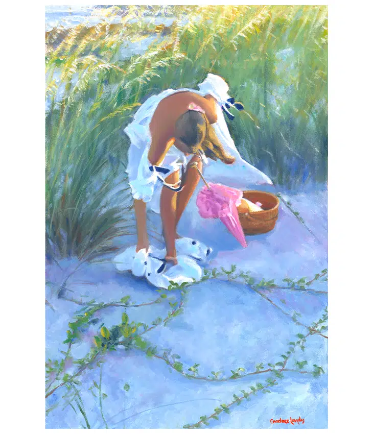
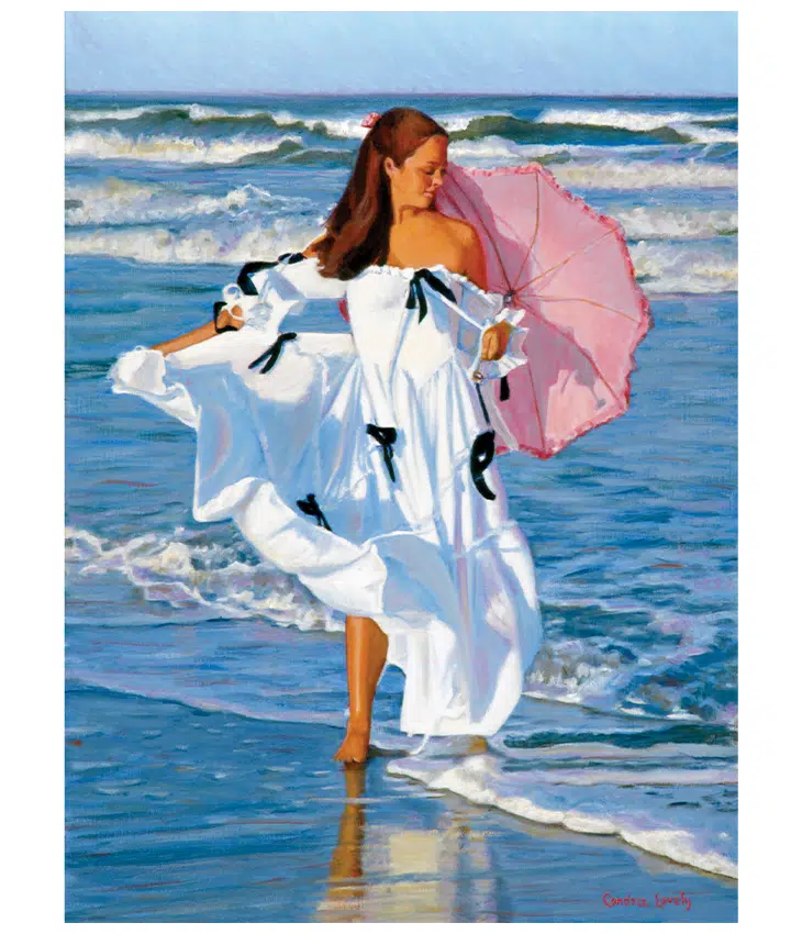
– Candace LovelyCandace Lovely’s “Good and Lovely” collection was born of a 2001 gallery show featuring “the element of attraction, where each painting tells a story in black and white, with a medium hue of pink.” The idea and palette were inspired when she was painting one of her many “fair women on the shore” pieces and noticed the combination of the model’s dark hair, black ribbons on a white dress, black dog, and the pink of the umbrella. “It reminded me of Good & Plenty™️ candies and how their bright colors made you feel” (considering the candies themselves, the colors on the box, and the era that incorporated these colors into pop culture).
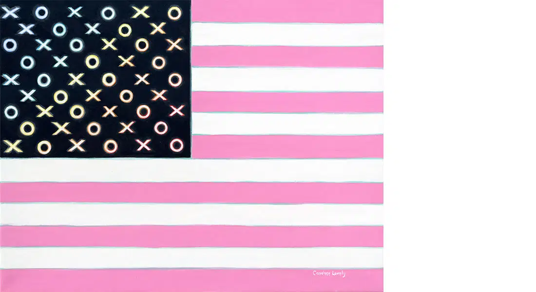
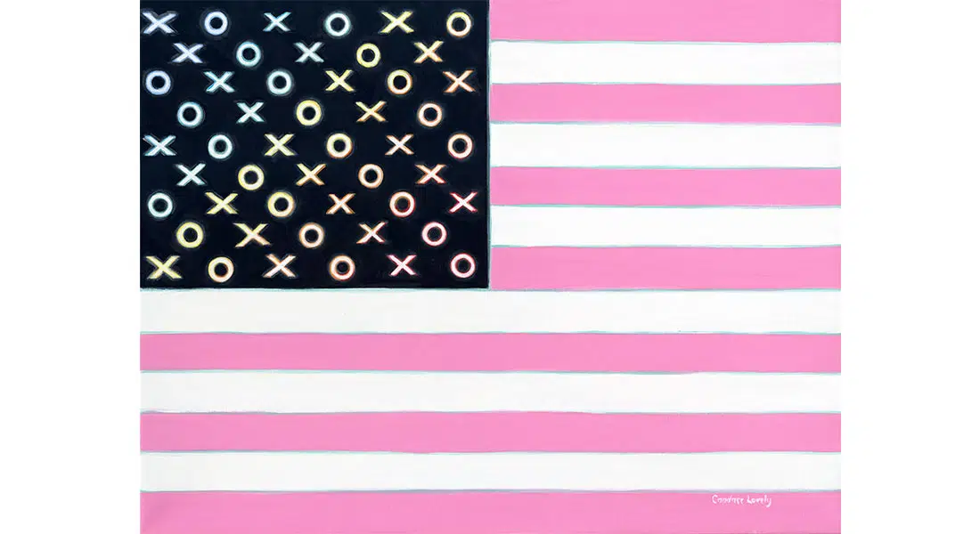
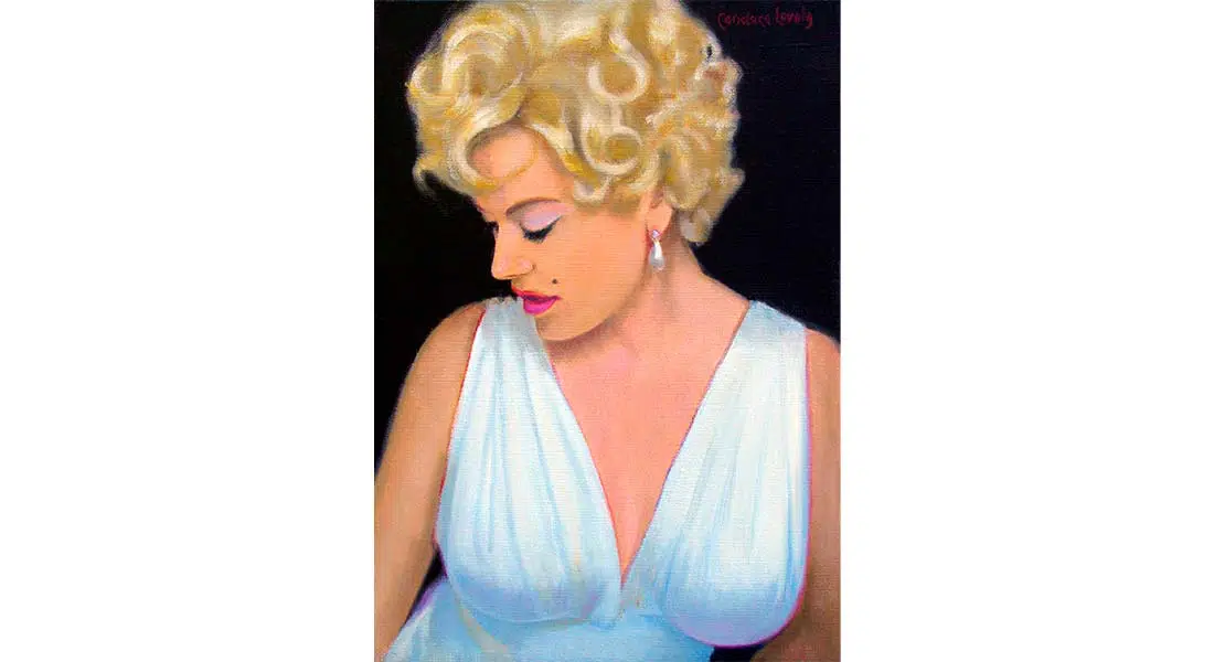
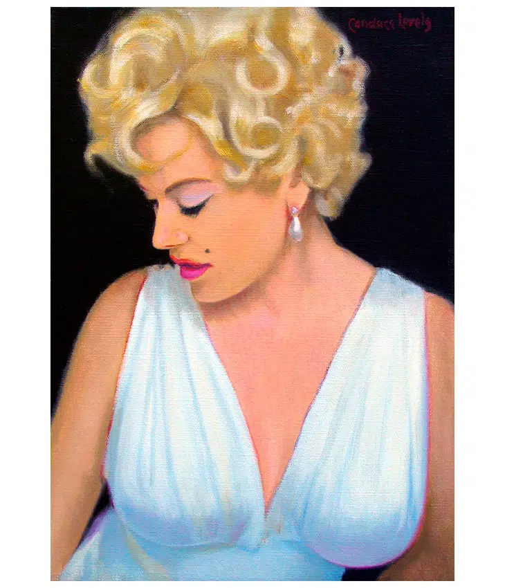
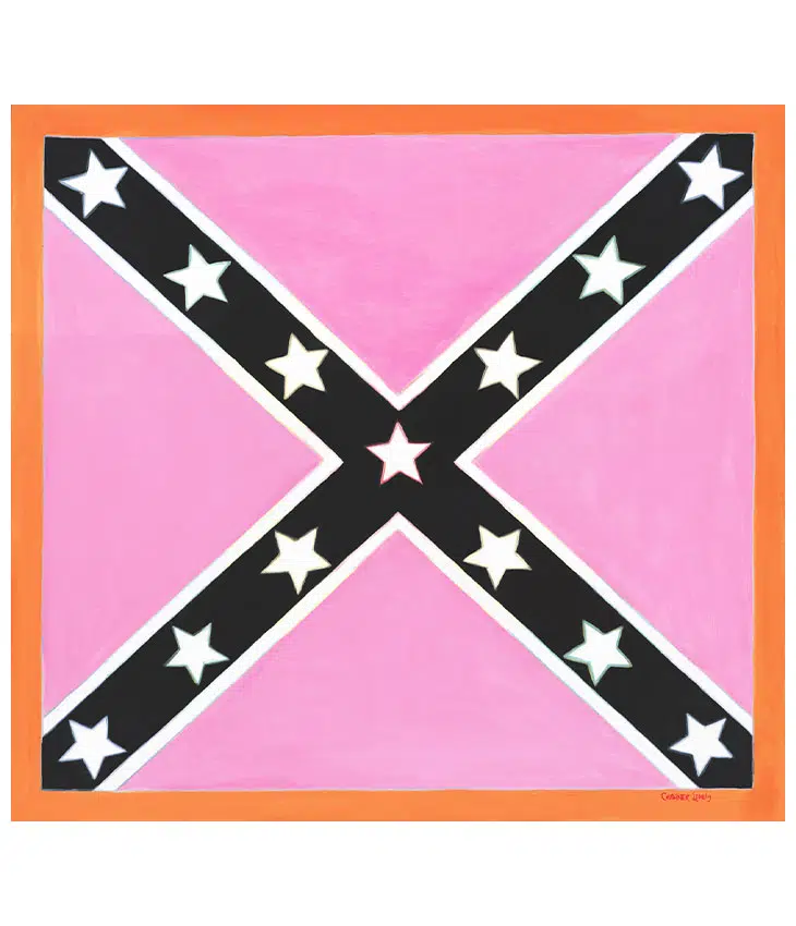
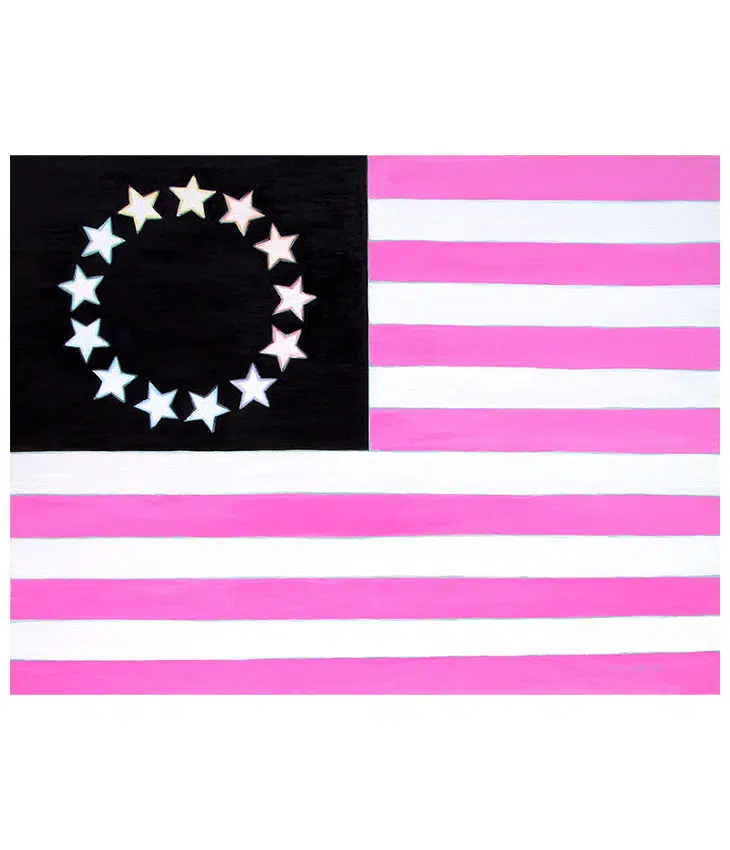
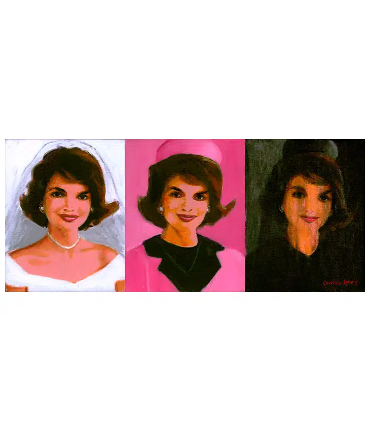
To create the collection, Lovely chose the most attractive iconic images. Perhaps the most prominent piece is the Jackie Kennedy tryptic which Lovely says “tells the story of her life without words, starting in white, peaking in pink, ending in black.” The flipside of the icon coin was Good and Lovely Marilyn, which in reality is a self-portrait with Lovely sitting as Monroe. Birthing the collection in 2001 when “flags were everywhere after 9/11,” Lovely turned to a set of historic flags, reimagining the Stars and Stripes and its colonial predecessor the Betsy Ross. Further exploring the concept of attraction – good and bad, as the artist clarifies – led to the inclusion of the confederate flag in an attempt to revisit one of the most controversial American images and bring together the edges of conflict and harmony.
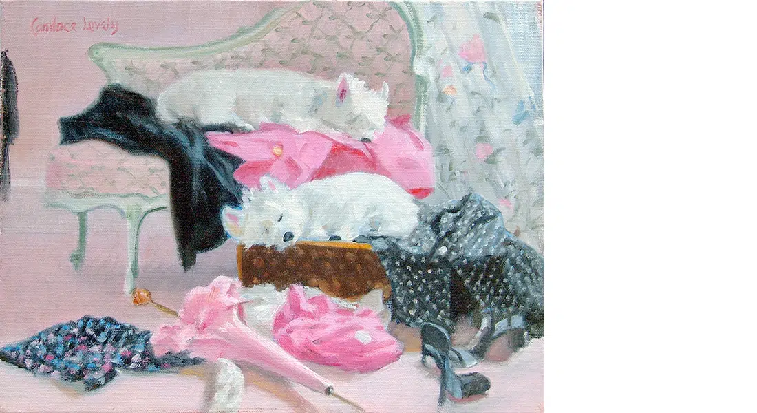
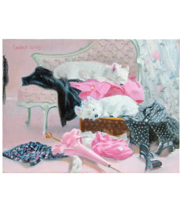
Good and Lovely’s color scheme is not exclusive to this collection but found throughout Lovely’s works. This is not unusual as the artist’s voice and passions are so well established, they often overlap: Fair women intertwine with Lowcountry when figures are painted against marshes; Nantucket intermingles with Still Life as Lovely populates a canvas with island objects. Similarly, the “Good and Lovely” palette can be found in nearly every collection (Westies and Fair Women most prominently), intended, as Lovely describes, “to use opposing values to attract the viewer.”
Candace Lovely’s “Good and Lovely” collection was born of a 2001 gallery show featuring “the element of attraction, where each painting tells a story in black and white, with a medium hue of pink.” The idea and palette were inspired when she was painting one of her many “fair women on the shore” pieces and noticed the combination of the model’s dark hair, black ribbons on a white dress, black dog, and the pink of the umbrella. “It reminded me of Good & Plenty™️ candies and how their bright colors made you feel” (considering the candies themselves, the colors on the box, and the era that incorporated these colors into pop culture).
To create the collection, Lovely chose the most attractive iconic images. Perhaps the most prominent piece is the Jackie Kennedy tryptic which Lovely says “tells the story of her life without words, starting in white, peaking in pink, ending in black.” The flipside of the icon coin was Good and Lovely Marilyn, which in reality is a self-portrait with Lovely sitting as Monroe. Birthing the collection in 2001 when “flags were everywhere after 9/11,” Lovely turned to a set of historic flags, reimagining the Stars and Stripes and its colonial predecessor the Betsy Ross. Further exploring the concept of attraction – good and bad, as the artist clarifies – led to the inclusion of the confederate flag in an attempt to revisit one of the most controversial American images and bring together the edges of conflict and harmony.
Good and Lovely’s color scheme is not exclusive to this collection but found throughout Lovely’s works. This is not unusual as the artist’s voice and passions are so well established, they often overlap: Fair women intertwine with Lowcountry when figures are painted against marshes; Nantucket intermingles with Still Life as Lovely populates a canvas with island objects. Similarly, the “Good and Lovely” palette can be found in nearly every collection (Westies and Fair Women most prominently), intended, as Lovely describes, “to use opposing values to attract the viewer.”


